
Insync Design
Client

Year
2024
Industry
Architecture


Solution
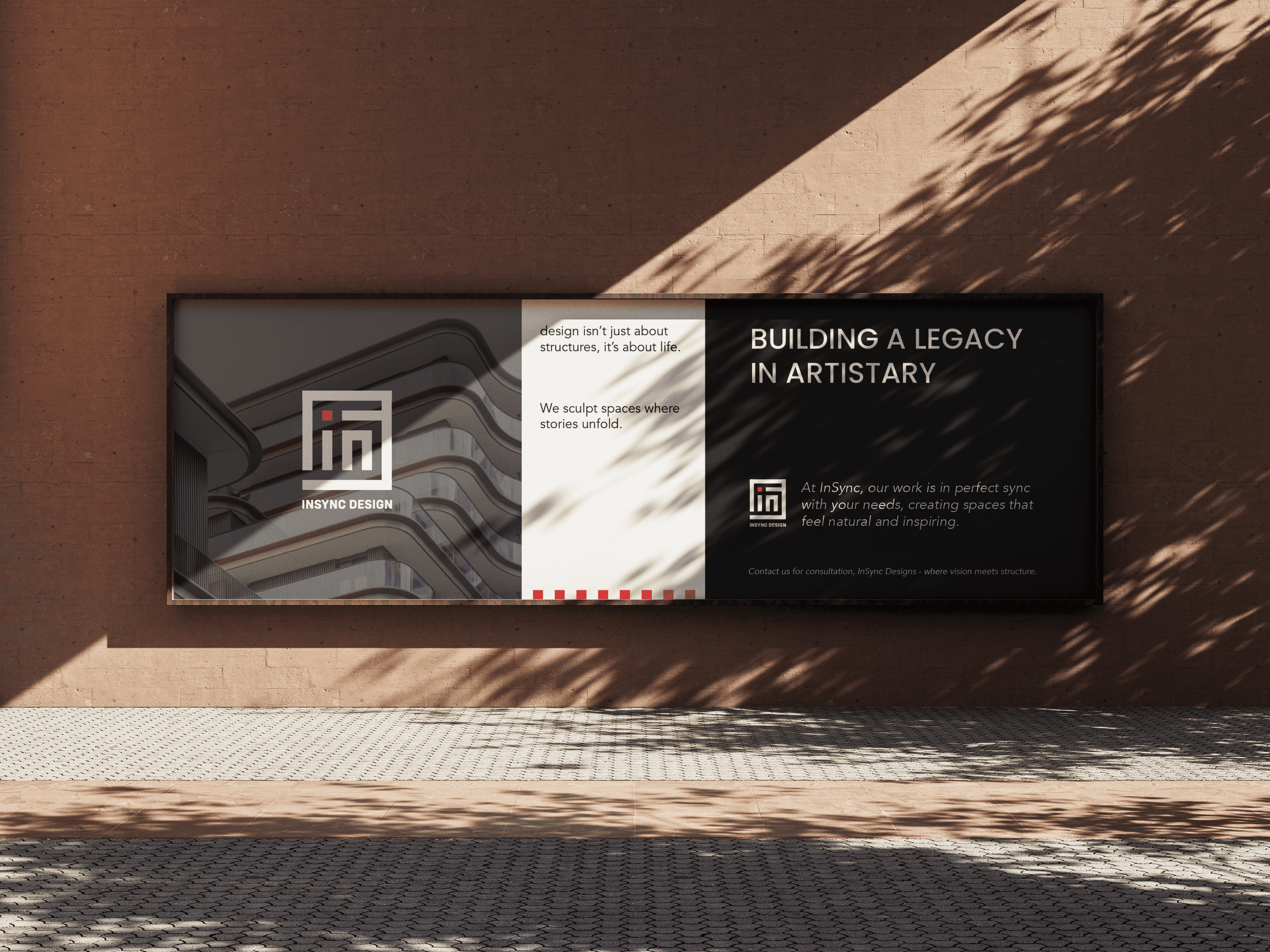
The logo was built using a system of lines inspired by architectural floor plans and spatial grids. Within the mark, the letters “i” and “n” act as room dividers inside the floor plan, while the “S” is formed entirely through negative space. This balance of structure and emptiness gives the identity a quiet intelligence, making the logo feel less like a graphic symbol and more like a spatial composition.


More work
A showcase of digital, print & experiential works we have done for various industries.

